REMAX Brand Upgrade 2.0
· REMAX
REMAX's new image
Brand upgrade shines brightly
Since its establishment in 2009, REMAX has become a leading brand in the industry with its outstanding achievements in the digital field. As a dynamic, passionate, fashionable and happy brand, REMAX adheres to the "My device, my life" ("My device my life") concept, is committed to providing a high quality of life, by the young consumer groups.

brand mission
Crafting the beauty of products with the heart of a craftsman
Create higher quality novel products, walk in the forefront of the times, so that consumers around the world can enjoy creative products. With the heart of a craftsman, we cut the beauty of products, pay attention to details and quality, and provide consumers with a better experience.
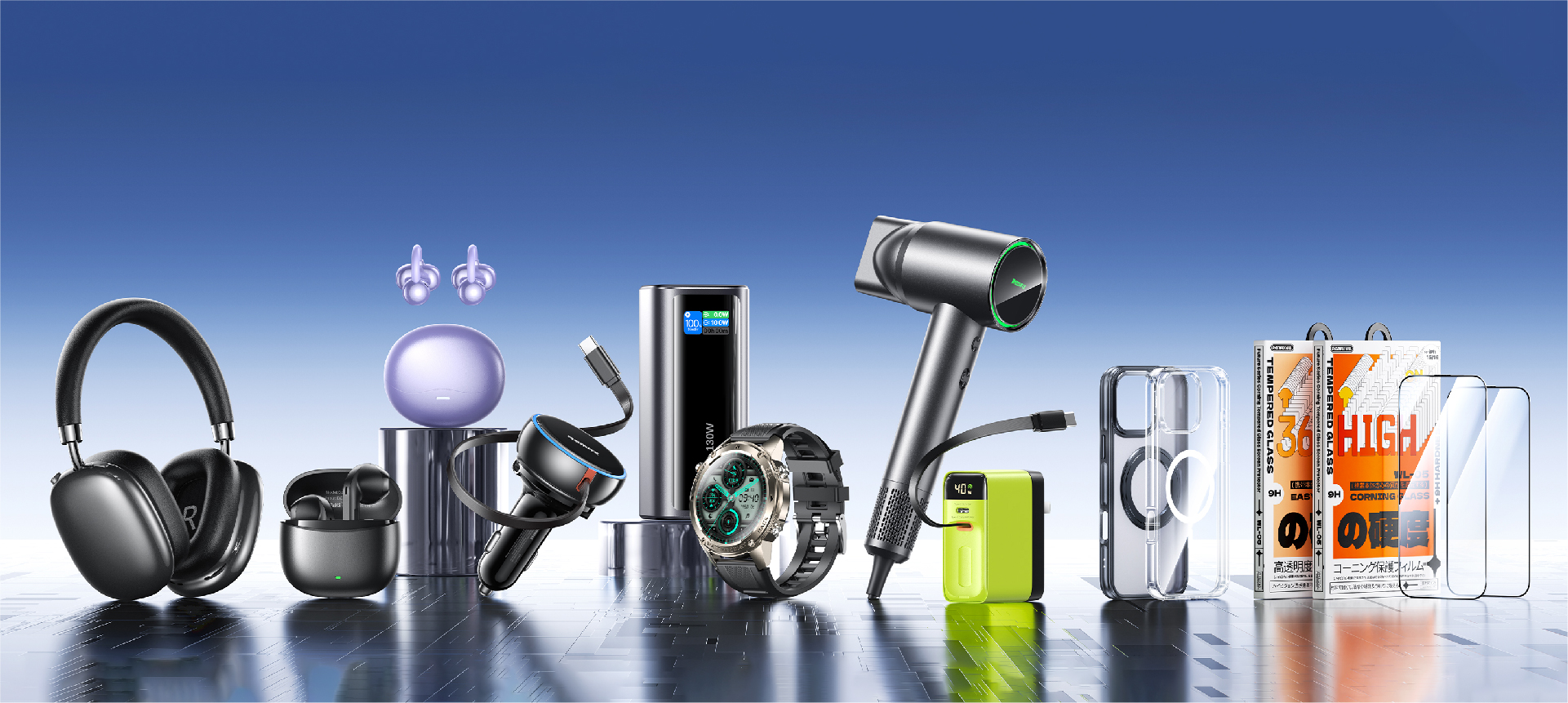
Brand Vision
A digital brand with a global presence
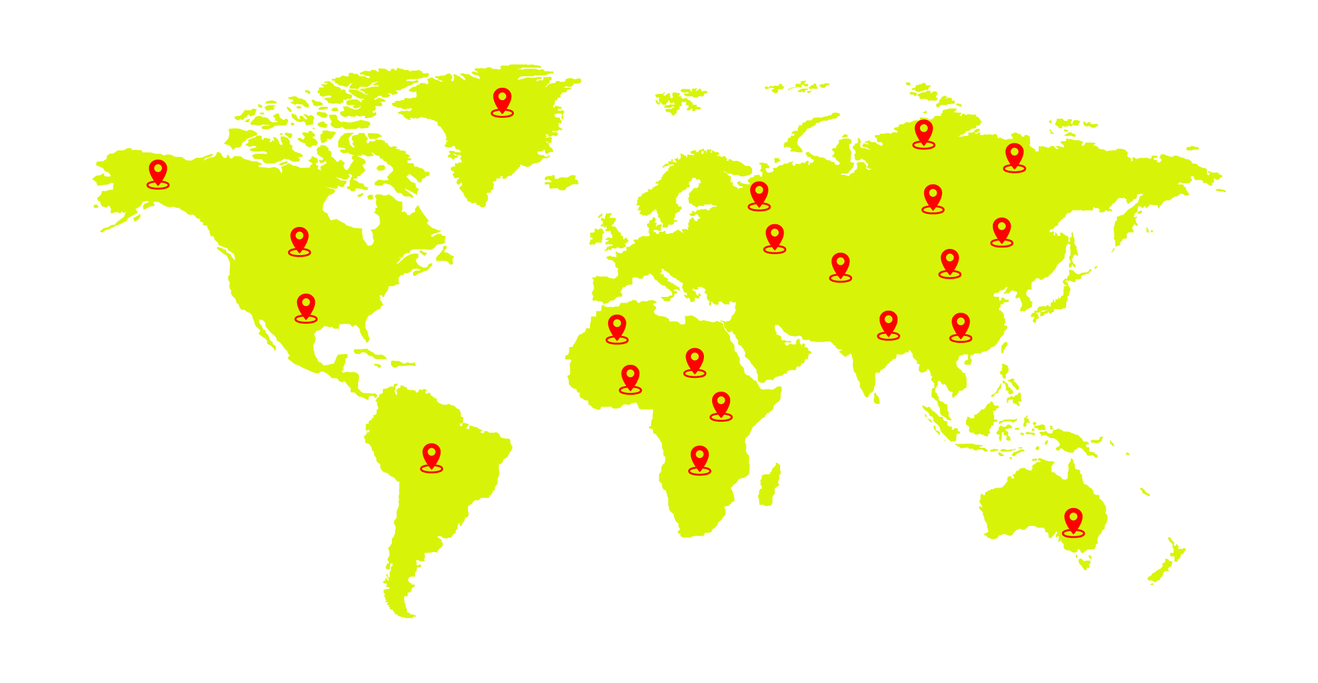
Driven by innovation and oriented by users' needs, we constantly break through ourselves and pursue excellence. more than 700 categories and 3,800 products are our insistence on quality and persistence on innovation.
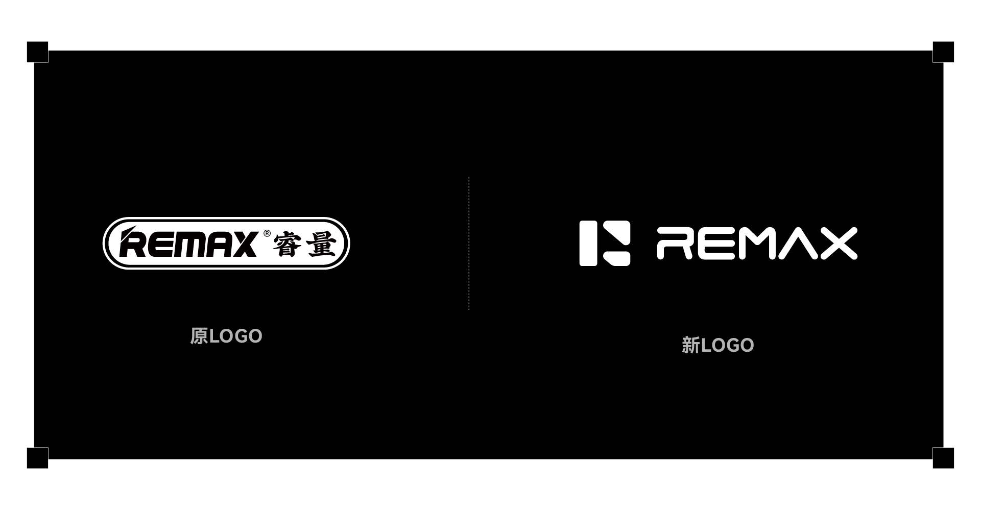
Logo Renewal
The brand logo was redesigned based on the brand's philosophy and core values. The original brand identity focuses on its name "REMAX", which is the direct expression of the brand and lacks the existence of brand personality. However, the new REMAX brand logo is simple and intuitive, and the collision of logo graphics reflects the diversified business ecology, reflecting the brand's vitality and foresight in the digital field. It breaks through the visual fatigue of traditional e-commerce and conveys the brand positioning of youthfulness and internationalization.
standard mapping
Our logo is the core element of the Riedel visual communication system. It is the universal symbol for each channel and the most direct representation of our company, our people and our brand.
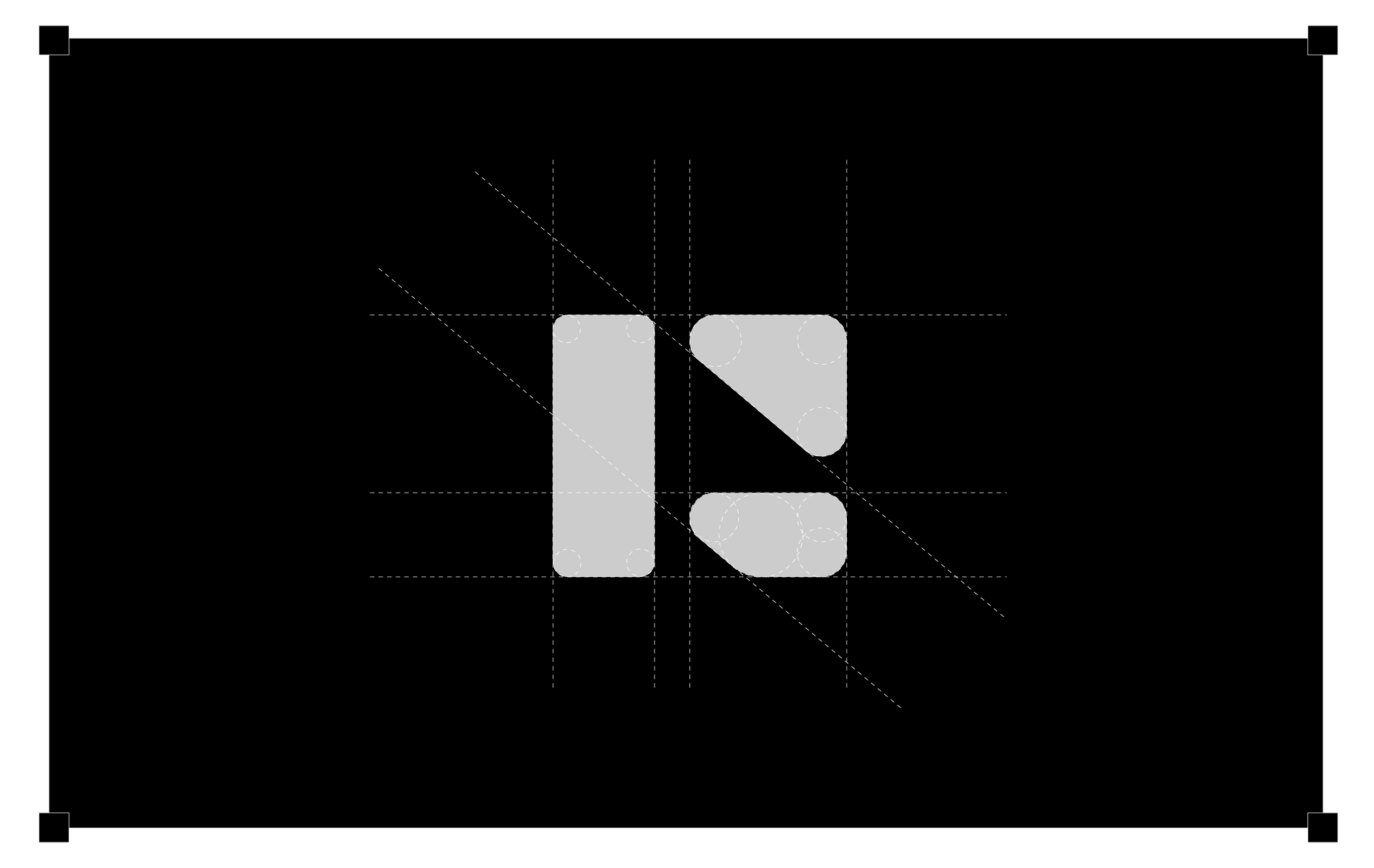
Logo elements
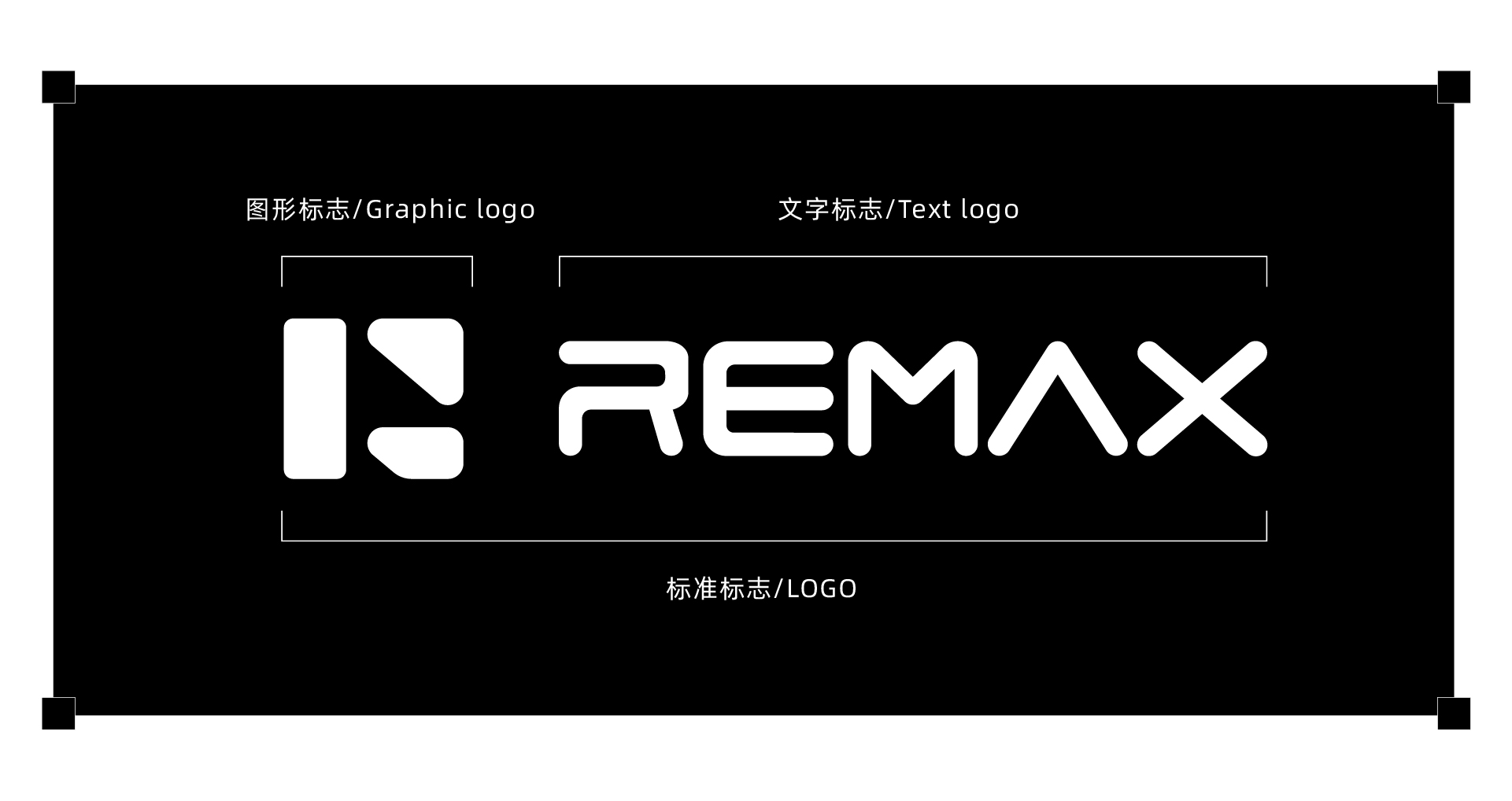
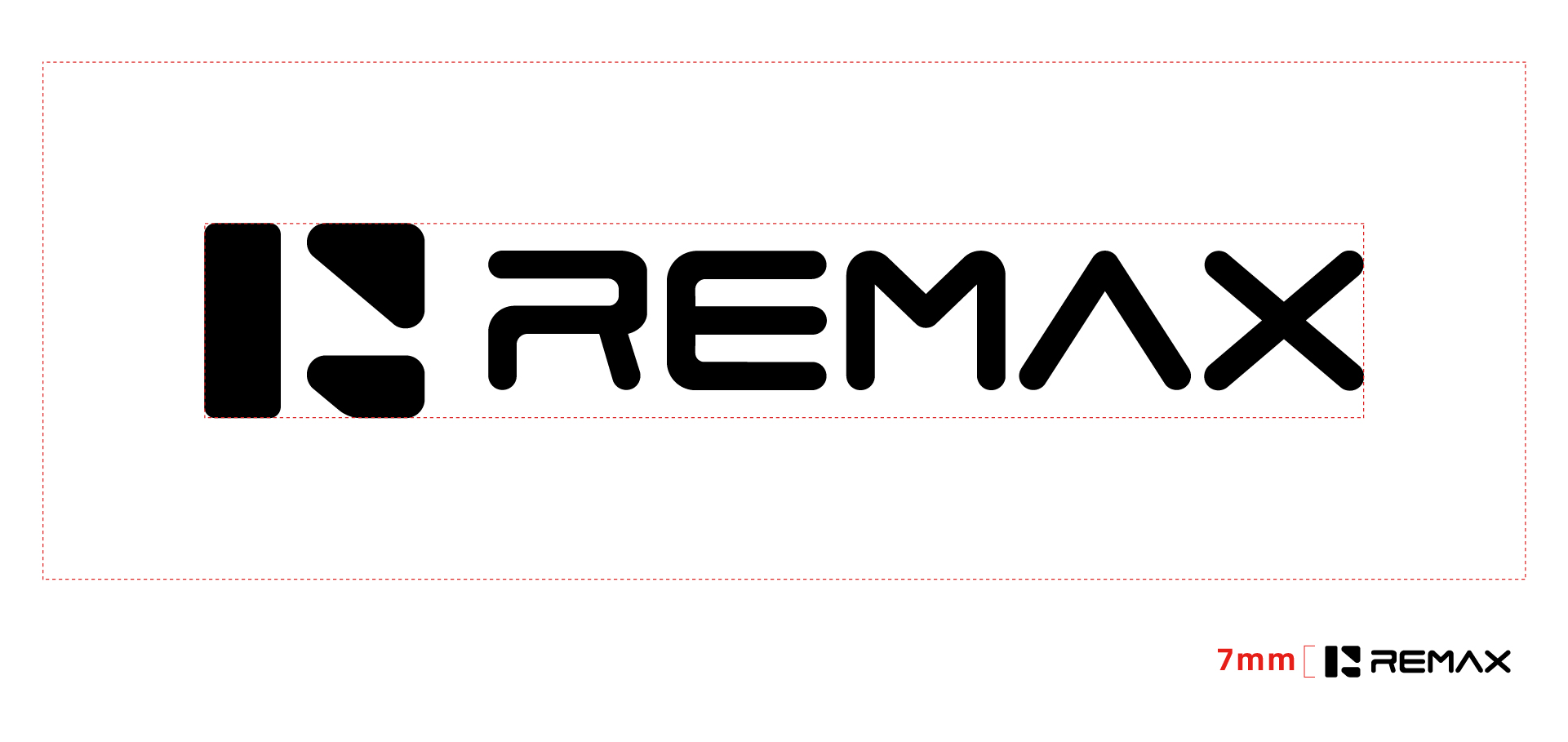
The Riedel logo consists of two elements: 1. a graphic logo and 2. a text logo, the relative size and position of which are fixed between the elements. The Riedel logo can only be used as a direct copy from the final specification file, not redrawn or combined without authorization.
monochrome reverse typeface
Company logos can be expressed in both yin and yang forms. Yin and Yang two graphics at the same time and can be expressed in a colored system and colorless system. This page shows the black and white yin and yang graphics, the scope of use is mainly applied to newspaper advertisements and other monochrome (black and white) within the scope of the printing, the use of which should be strictly in accordance with this specification.
Brand Standard Colors
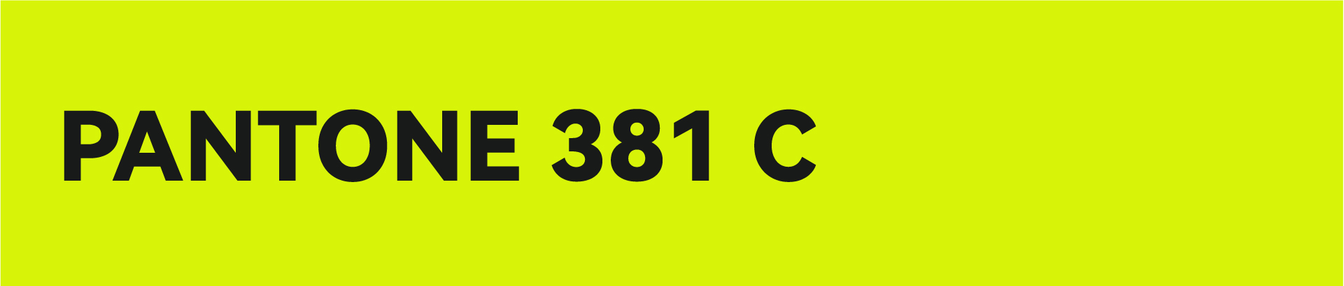
C25 M0 Y85 K0
R207 G221 B60
#d7f408
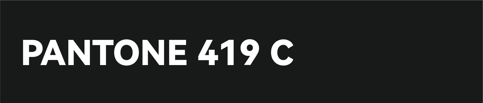
C85 M80 Y80 K65
R24 G26 B25
#181A19
standard characters
The fashionable font form fits the trend of the electronic and digital industry and conveys enthusiasm and vitality. Our mission is to drive the brand to walk in the forefront of the times and interpret the vision of letting global consumers enjoy creativity and embrace happiness through a unique and recognizable design, and to become a fashionable and happy symbol in the global digital field with a trendy posture.
Mark the non intrusive area
In order to promote the brand identity more clearly and effectively, a minimum sized blank space must be maintained around the brand identity, which is called a restricted area. No text, symbols, or other elements are allowed to appear within the restricted area.
Non invasive range: ≥ 30mm
Brand design concept
REMAX is not only at the forefront of technological innovation, but also committed to becoming a leader in leading industry trends.

We are in an era of brand competition, where brand image always serves the brand strategy of the enterprise. In the current fast-paced product iteration, simplicity and clarity are the most intuitive ways of presentation; Fashionable and concise brand tone can effectively achieve visual communication and dissemination, increase users' trust in the enterprise, and strengthen memory points. Brand upgrading is a necessary path for the long-term development of every brand.
The REMAX logo uses simple and modern fonts as a carrier to convey brand vitality and innovative genes. The stylish and rounded font design is in line with industry trends, interpreting cutting-edge aesthetics with simplicity, allowing global consumers to perceive the brand temperature of REMAX's "vitality, enthusiasm, fashion, and happiness" in the technological experience. With the logo as a window, we embark on a creative digital life journey.
The Ruiliang yellow background showcases fashion and passion, while the black font embodies professionalism and reliability, symbolizing the brand's commitment to connecting "my devices, my life" with creative products, helping global consumers embrace intelligent digital life, and moving towards the vision of becoming a top 3C digital brand, as well as the brand core of fashion, trend, and innovation linking life.
Enable global consumers to connect beauty through creative products, pursue fashionable technology, and focus on quality of life